SPECIAL 80th
ANNIVERSARY PAGE


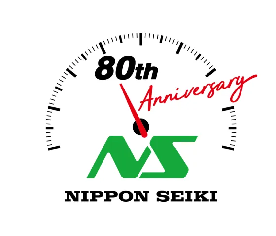
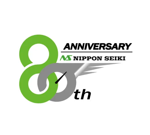
The commemorative logo design, which serves as the symbol of our 80th anniversary, was solicited internally to capture the essence of 'Nippon Seiki-ness' and 'the future of Nippon Seiki.' From among 67 candidate works, the final design was chosen through employee voting. Here is the logo that was selected from among the creative and humorous entries.

Concept
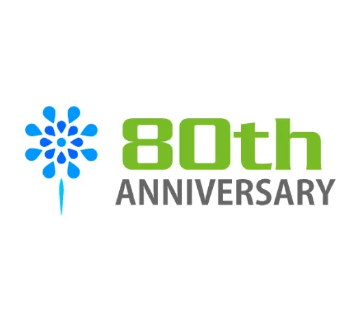
This logo prominently features the automotive meters that we manufacture and incorporates elements of our current logo and corporate color, green, to maintain our brand identity. Additionally, it emphasizes the milestone with the design elements "80th" and "ANNIVERSARY." The depth of the logo symbolizes our aspiration to continue advancing as we have in the past and will in the future.

We presented an internal award to the top prize winner!
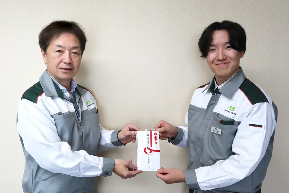
Left : Executive Vice President ; Keiichi Nagano
Right(Top Prize Winner) : Component Engineering Dept. Component Software Engineering ; Takumi Hanazawa
Interview with the Top
Prize Winner
Q. Could you please tell us about your usual work duties?
I design and test software for consumer products. Recently, I was responsible for designing a remote control for air conditioning units and conducting operational tests for a carbon monoxide checker developed in collaboration with Snow Peak.
Q. What motivated you to participate in the contest?
Since I enjoy drawing as a hobby, I thought it would be wonderful to see a design I created featured as the company's commemorative logo in various places within the company and around town. This motivated me to take on the challenge.
Q. Did you have confidence in your design?
I didn't have strong confidence in my design, but I do have a passion for drawing. Receiving a lot of votes this time has boosted my confidence, and I am very happy about it.
Q. Please tell us about the feelings and thoughts you put into the logo.
Based on the corporate color green of Nippon Seiki, the logo features a meter that our company manufactures, representing the essence of Nippon Seiki. By adding a sense of depth, we have also included our wish for the company to continue moving forward both now and in the future.
Q. Please tell us about your future aspirations!
I am truly honored that my idea was chosen for the logo to commemorate our 80th anniversary! I hope to not only stop at the logo but also continuously challenge myself in various tasks and strive to keep progressing in my work.

Here are the top-ranking works!
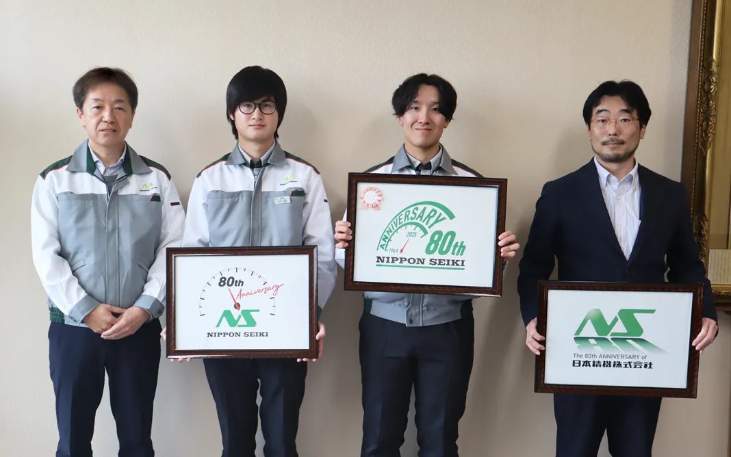
A commemorative photo of the top three winners and the Vice President
The two award-winning works
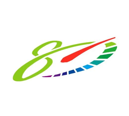
This logo commemorates our 80th anniversary, designed with the image of the needle pointing at 80 km/h on a meter, one of our company's main products.
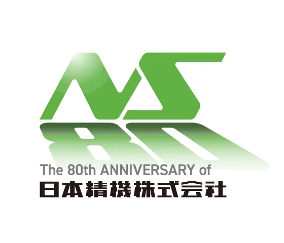
The message, "Currently standing on the accumulation of our predecessors' 80 years of efforts," is expressed by incorporating the number 80 into the graphic, appearing like a shadow of our company logo.
Top Works Gallery

A multitude of imaginative ideas came together, marking a great start to
celebrate the anniversary.
What's embodied in the logo:
"The significance and gratitude
of the 80th anniversary"
"Commitment to further progress"
With these values in mind, the entire team
will continue to contribute toward a safe
and sustainable future.
